
To understand what Abhinav Mishra is attempting with his new bridal capsule, Crimson, you have to first reckon with how much weight the colour red carries before a designer ever touches it. In India, red is not a bridal preference. It is closer to a load-bearing wall in the architecture of marriage itself.
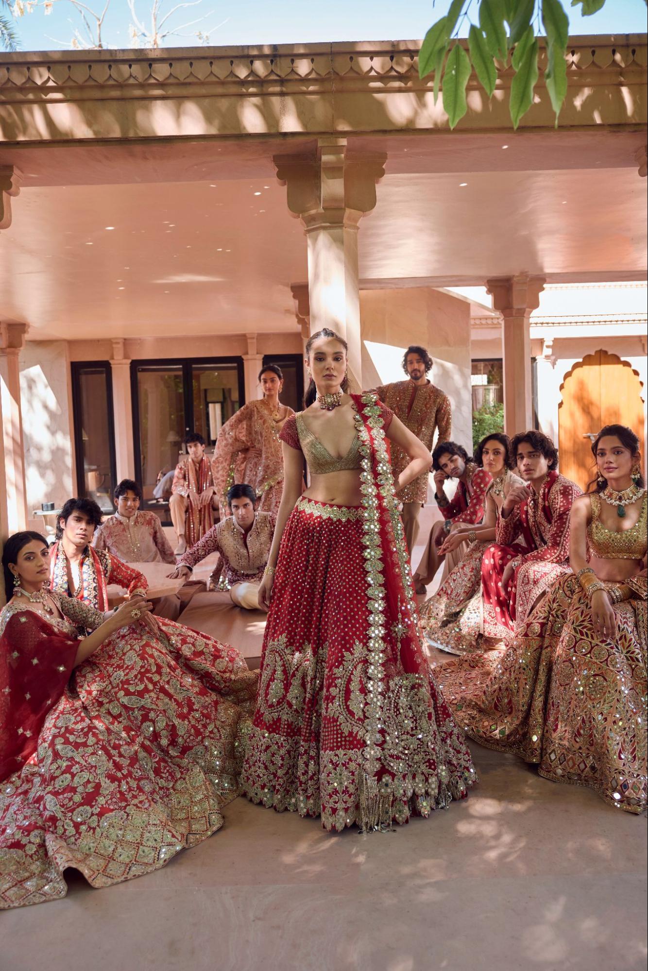
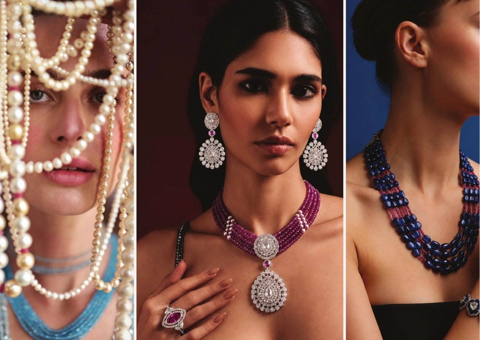
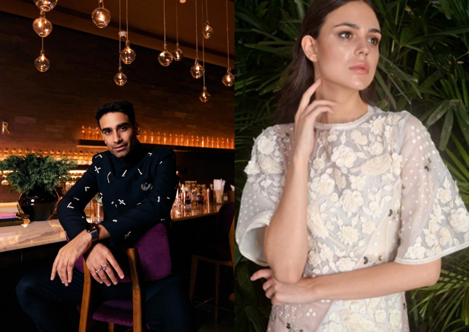
All images courtesy of Abhinav Mishra
The lineage runs deep. Historical records indicate that red bridal attire was prevalent during the Vedic period, which dates back over 3,500 years, when the colour was associated with Agni, the fire god, and believed to purify and sanctify the wedding ceremony. That association is literal, not metaphorical: the sacred fire, the orange-red of agni, is the witness to the vows themselves. The colour then threads through the entire vocabulary of the ceremony. It appears in the sindoor in her hair, the kumkum on her forehead, the alta on her feet, the bangles on her wrists, each carrying the same weight. In Hindu thought red is also associated with the goddess Durga, a symbol of shakti or cosmic power, so that a bride in red is understood to be channeling something larger than personal style.
There is a sociological sharpness to how absolute this is, visible most starkly in its absence. Red is tied so deeply to married life, to active feminine energy, to Shakti in motion, that once that chapter ends, the colour does too; widows have historically worn white, not red. A colour that maps this precisely onto a woman's marital and social status has stopped being decorative and started functioning as language. For most of history, wearing it on a wedding day was less a choice than a declaration.
The Colour That Wears the Bride
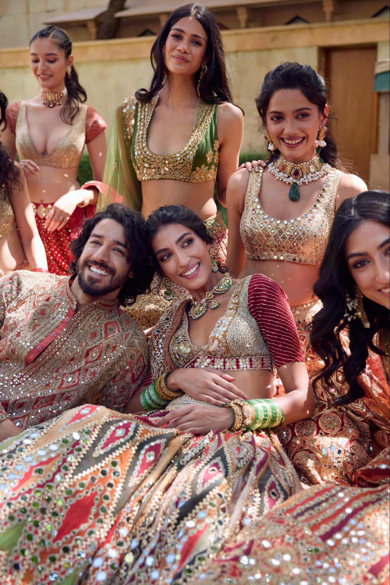
This is the inherited monument Mishra decides to walk around. His premise for Crimson comes from botany. The Rangoon flower opens pristine white, moves through blush pink, and deepens into crimson before it fully blooms, and Mishra takes that final stage as his beginning. It is a move with a cinematic logic to it, closer to how Wong Kar-wai holds a single saturated hue until colour itself becomes the emotion than to the everything-at-once maximalism most bridalwear chases. The flower earns its red through transformation, which reframes the most default colour in the room as something arrived at rather than assumed.
A Flower That Refuses to Rush
Crimson continues the story Mishra began with Baradari, his earlier meditation on togetherness. Where Baradari celebrated the grandeur of collective celebration, this capsule turns toward what settles afterward, the shared moments with loved ones and cherished traditions that stay long after the festivities have ended. There is something novelistic in building collections as sequential chapters, the way a director returns to the same universe at a different emotional temperature. Mishra has always worked this way. His collections carry names like Shrine, One Love, Tribe, and The Queen's Palace, each a room in a house he keeps extending.
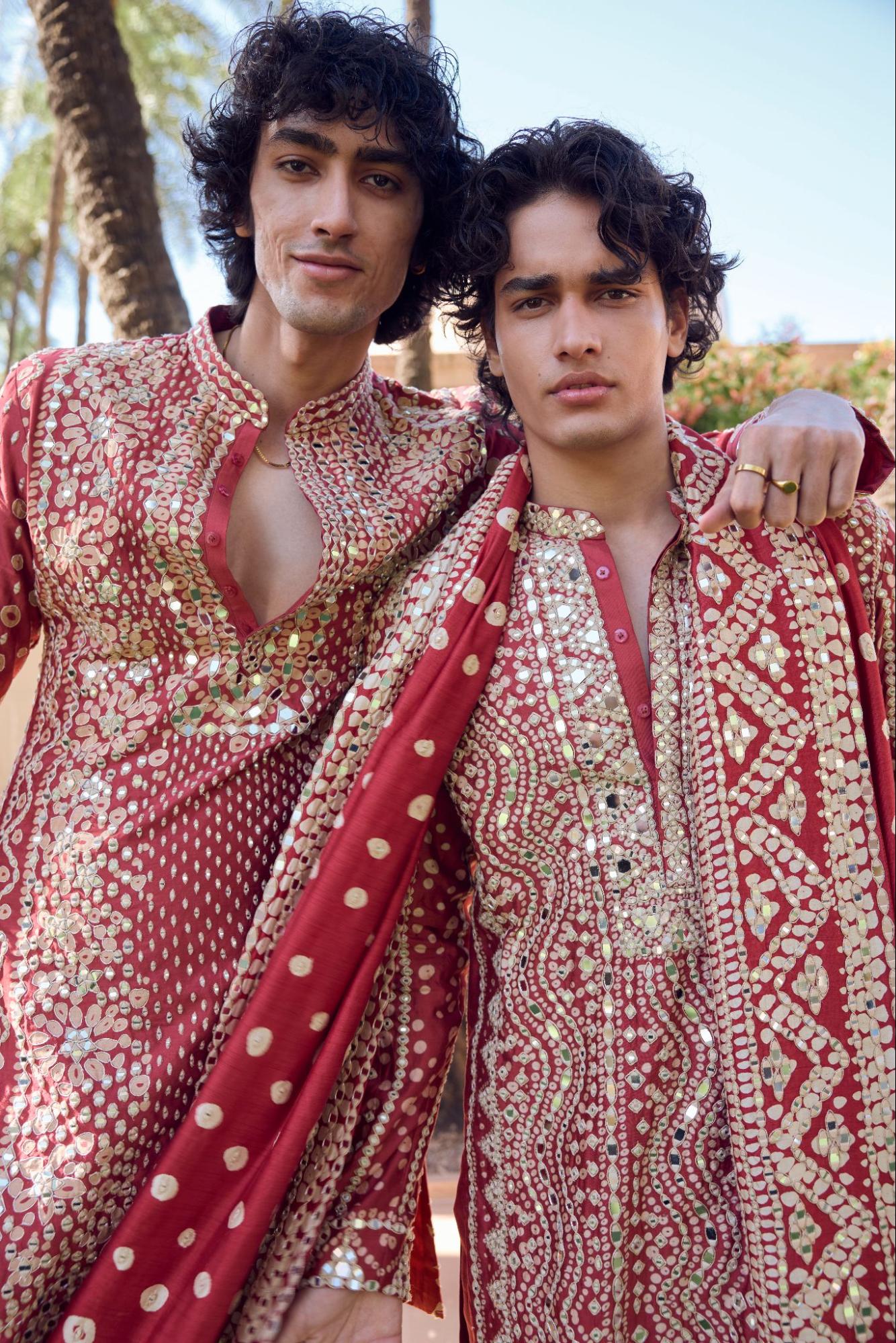
He describes the through-line himself. Speaking about the inspiration behind the capsule, Mishra says:
"BARADARI was created as a celebration of togetherness, and CRIMSON felt like its natural continuation. I've always been fascinated by the Rangoon flower and the way it transforms before reaching its deepest crimson bloom. That journey felt symbolic of celebration itself - growing richer with every emotion and every shared moment. With CRIMSON, I also wanted to celebrate India's rich craft heritage by bringing together the beauty of Rangoon blooms, Kalamkari and Bandhani through our signature mirror work, handcrafted embroideries and watercolour-inspired prints. Crimson has always held a special place in Indian weddings, and this collection is my interpretation of that timeless colour for the modern bride."
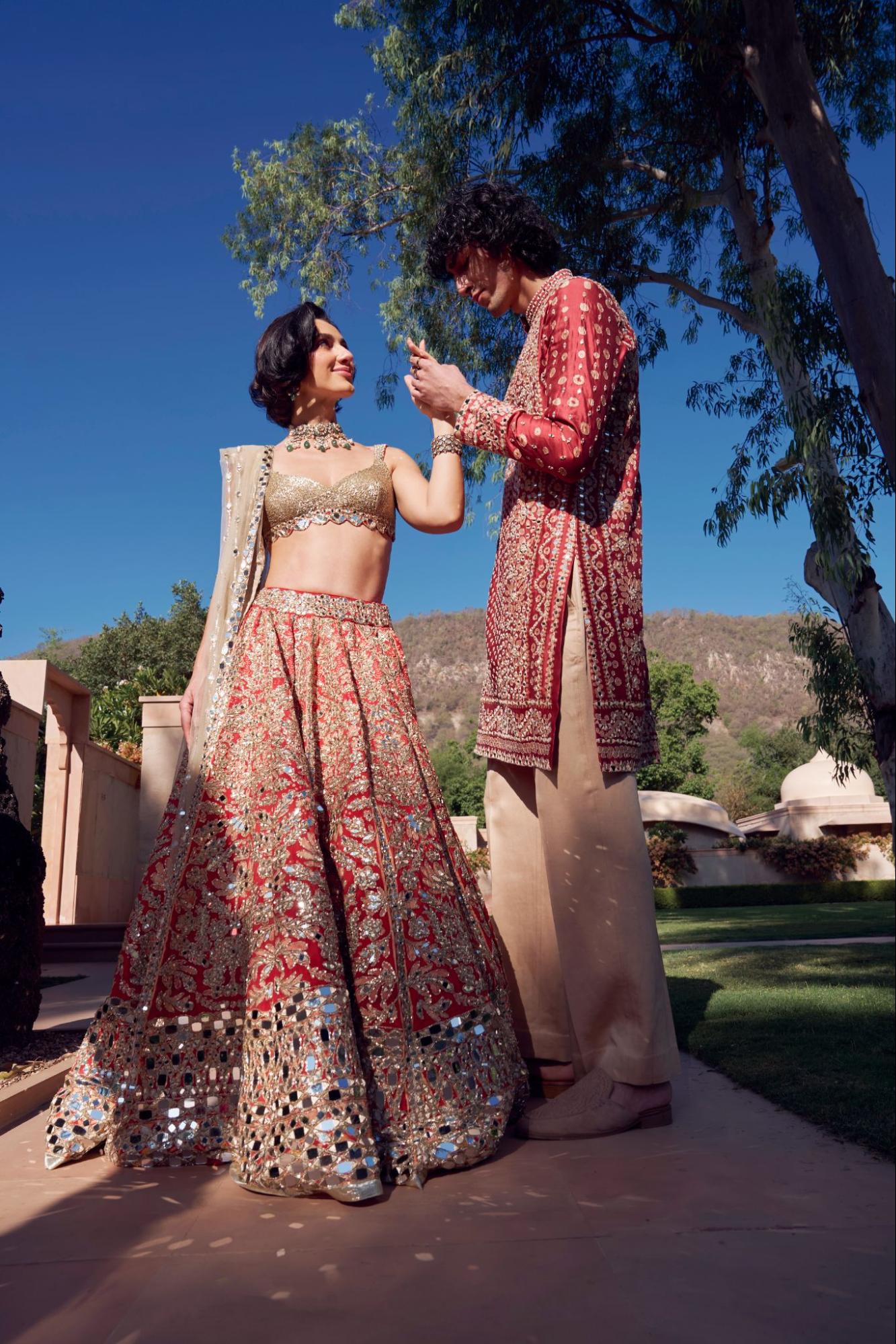
The line to hold onto is the last one. To offer an interpretation of a colour this fixed is a difficult brief. Crimson moves past the classic red bridal lehenga, reinterpreting the vocabulary through crimson prints, coral hues, and handcrafted detailing. That is a real departure in a category where the red lehenga sits close to non-negotiable, and stepping around it while staying unmistakably bridal takes the confidence of someone fluent enough in the rules to bend them.
Where Kalamkari Meets Bandhani
The technical core of Crimson lies in making three separate traditions speak to one another. Delicate watercolour-inspired prints featuring Rangoon florals get layered with Kalamkari-inspired botanical artwork, Bandhani textures, heritage floral motifs, stylised birds, colourful stripes, and geometric layouts. These come from different lineages entirely. Kalamkari is a pen-and-dye storytelling craft from Andhra Pradesh, built on fine botanical line; Bandhani is the resist-dye tie technique of Gujarat and Rajasthan, composed of thousands of tiny knotted dots. Setting a painterly floral against both risks decorative overload. What steadies it is the fabric base, chanderi silk, organza silk, and special net, textiles light enough to keep the layering breathable.
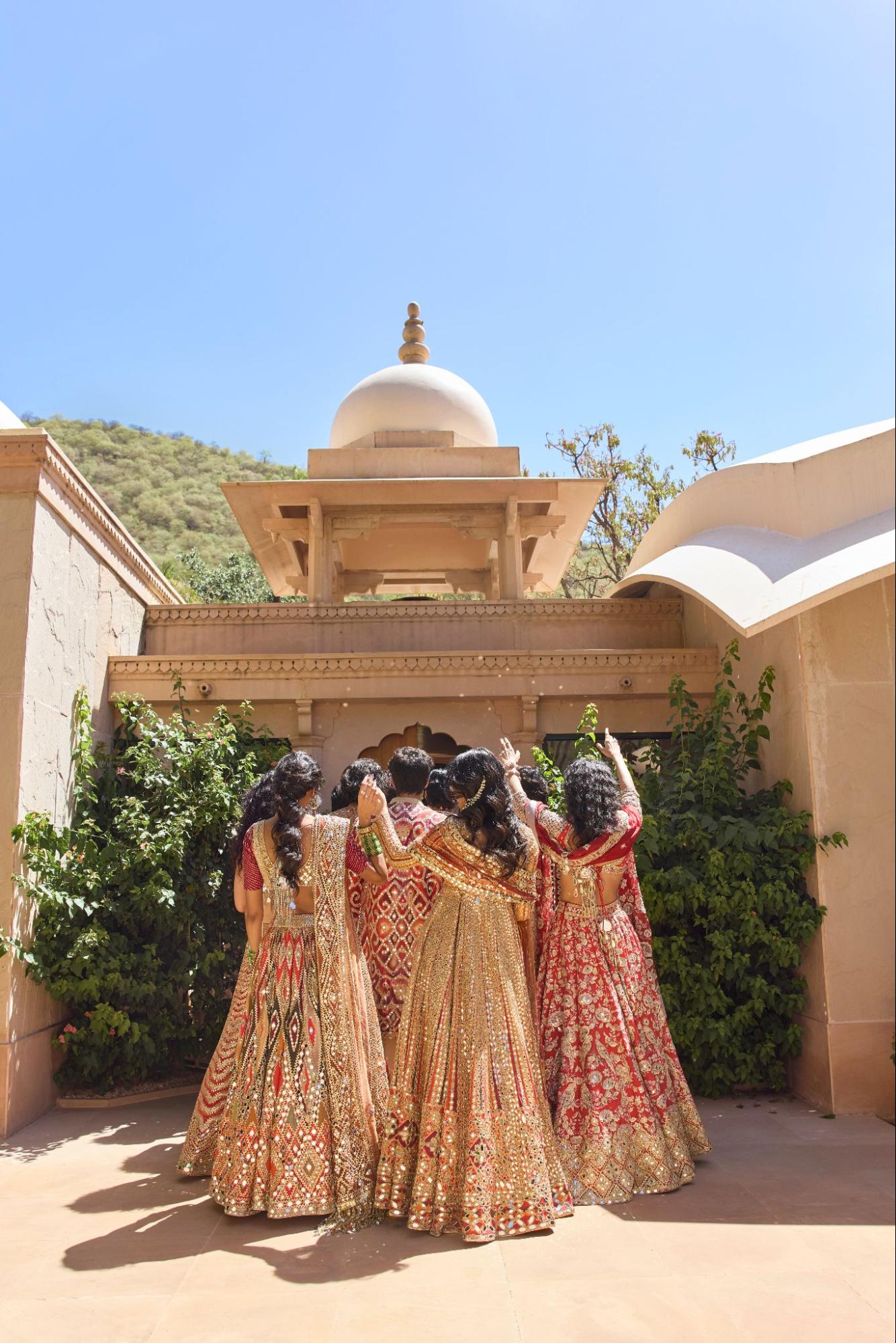
At the centre sits Mishra's mirror work, the craft he built his name reviving for a younger generation. Here it is elevated through gota patti, aari, zardozi, dori, sequins, and hand embroidery, and each of these catches light on its own terms. Gota patti gives a flat metallic gleam, zardozi a raised dimensional shine, sequins a scattered flicker. A mirror ringed by one technique becomes a different object than the same mirror ringed by another, which gives the eye distance to travel even inside a narrow palette.
What a Single Red Reveals
The palette is where Crimson stakes its clearest position. It explores rich shades of crimson, vibrant corals, and soft tonal hues, accented with antique ivory and subtle gold. Mishra's previous collection celebrated vibrant multicoloured prints. This one pulls the range toward the monochromatic, and that compression changes what the eye picks up. When colour stops competing for attention, texture and technique advance. It is the difference between a room in twelve colours and a room done entirely in tonal reds, where you begin to register the weave of the cloth, the depth of an embroidery, the way ivory cools a corner. Working in a single colour is the harder discipline, since a weak passage has nowhere to hide.
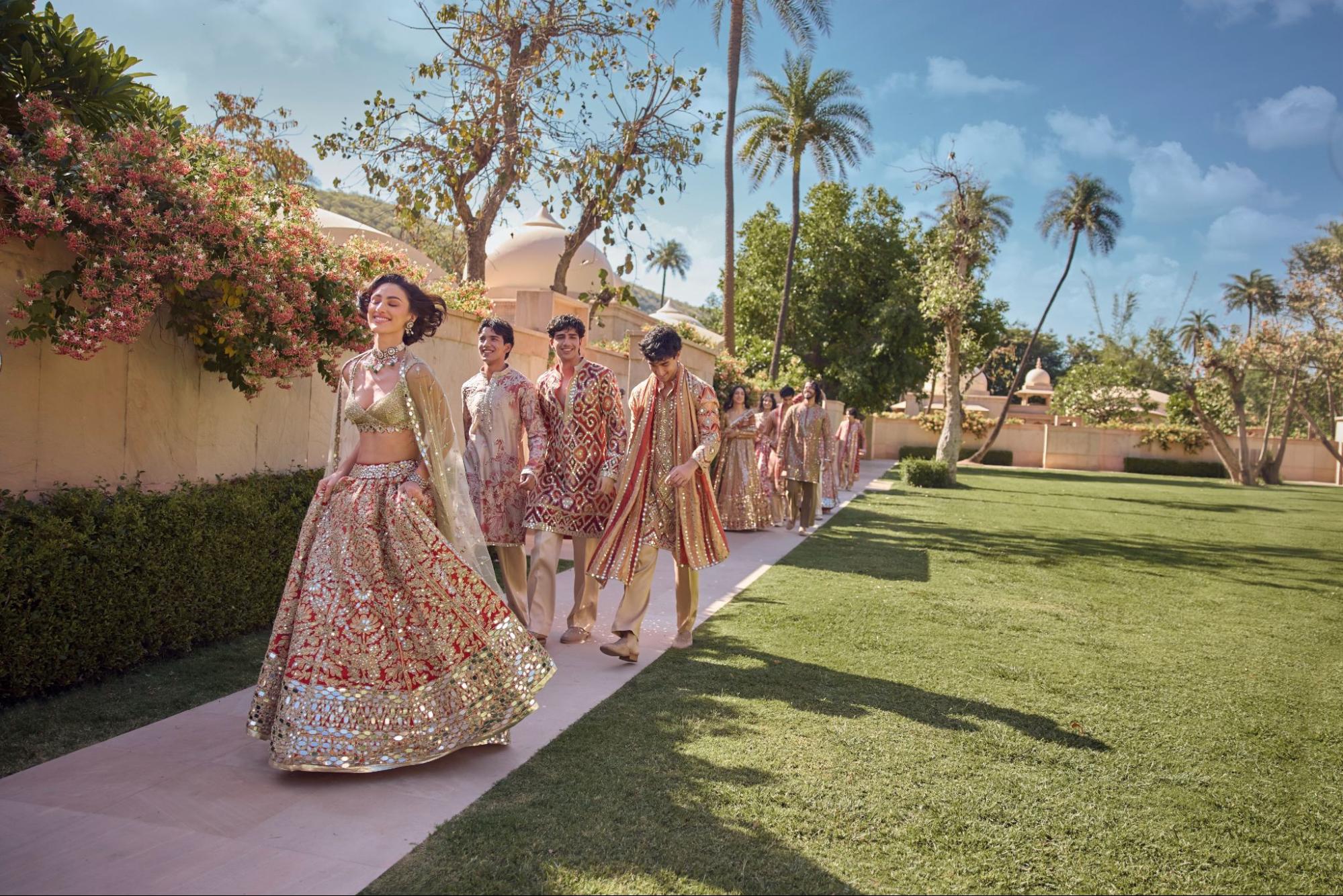
There is an irony in the choice. Crimson is at once the most conventional colour a bride could pick and, in Mishra's hands, the vehicle for stepping outside convention. The capsule sits inside the world he has been building since the label's official launch in 2017, one now retailing across 45+ countries, where the clothes arrive alongside music he personally conceptualises and produces, the soundtrack grown as recognisable as the mirror work. A colour that has spent 3,500 years signalling status, fertility, and divine feminine power is here handed back as something to look at closely again, its meaning loosened just enough to let a modern bride decide for herself what she is declaring.
TO BE CONTINUED, FOR SUBSCRIBERS ONLY.
This is where the surface ends and the reporting begins.
The complete piece, the full archive, and access to The French Press Circle. Reporting answerable only to its readers.
Already a subscriber ?
Login
Read these on the house, with our compliments.
A selection from the current issue, open to all readers. Read them in full. The rest is one decision away.








To understand what Abhinav Mishra is attempting with his new bridal capsule, Crimson, you have to first reckon with how much weight the colour red carries before a designer ever touches it. In India, red is not a bridal preference. It is closer to a load-bearing wall in the architecture of marriage itself.
All images courtesy of Abhinav Mishra
The lineage runs deep. Historical records indicate that red bridal attire was prevalent during the Vedic period, which dates back over 3,500 years, when the colour was associated with Agni, the fire god, and believed to purify and sanctify the wedding ceremony. That association is literal, not metaphorical: the sacred fire, the orange-red of agni, is the witness to the vows themselves. The colour then threads through the entire vocabulary of the ceremony. It appears in the sindoor in her hair, the kumkum on her forehead, the alta on her feet, the bangles on her wrists, each carrying the same weight. In Hindu thought red is also associated with the goddess Durga, a symbol of shakti or cosmic power, so that a bride in red is understood to be channeling something larger than personal style.
There is a sociological sharpness to how absolute this is, visible most starkly in its absence. Red is tied so deeply to married life, to active feminine energy, to Shakti in motion, that once that chapter ends, the colour does too; widows have historically worn white, not red. A colour that maps this precisely onto a woman's marital and social status has stopped being decorative and started functioning as language. For most of history, wearing it on a wedding day was less a choice than a declaration.
The Colour That Wears the Bride
This is the inherited monument Mishra decides to walk around. His premise for Crimson comes from botany. The Rangoon flower opens pristine white, moves through blush pink, and deepens into crimson before it fully blooms, and Mishra takes that final stage as his beginning. It is a move with a cinematic logic to it, closer to how Wong Kar-wai holds a single saturated hue until colour itself becomes the emotion than to the everything-at-once maximalism most bridalwear chases. The flower earns its red through transformation, which reframes the most default colour in the room as something arrived at rather than assumed.
A Flower That Refuses to Rush
Crimson continues the story Mishra began with Baradari, his earlier meditation on togetherness. Where Baradari celebrated the grandeur of collective celebration, this capsule turns toward what settles afterward, the shared moments with loved ones and cherished traditions that stay long after the festivities have ended. There is something novelistic in building collections as sequential chapters, the way a director returns to the same universe at a different emotional temperature. Mishra has always worked this way. His collections carry names like Shrine, One Love, Tribe, and The Queen's Palace, each a room in a house he keeps extending.
He describes the through-line himself. Speaking about the inspiration behind the capsule, Mishra says:
"BARADARI was created as a celebration of togetherness, and CRIMSON felt like its natural continuation. I've always been fascinated by the Rangoon flower and the way it transforms before reaching its deepest crimson bloom. That journey felt symbolic of celebration itself - growing richer with every emotion and every shared moment. With CRIMSON, I also wanted to celebrate India's rich craft heritage by bringing together the beauty of Rangoon blooms, Kalamkari and Bandhani through our signature mirror work, handcrafted embroideries and watercolour-inspired prints. Crimson has always held a special place in Indian weddings, and this collection is my interpretation of that timeless colour for the modern bride."
The line to hold onto is the last one. To offer an interpretation of a colour this fixed is a difficult brief. Crimson moves past the classic red bridal lehenga, reinterpreting the vocabulary through crimson prints, coral hues, and handcrafted detailing. That is a real departure in a category where the red lehenga sits close to non-negotiable, and stepping around it while staying unmistakably bridal takes the confidence of someone fluent enough in the rules to bend them.
Where Kalamkari Meets Bandhani
The technical core of Crimson lies in making three separate traditions speak to one another. Delicate watercolour-inspired prints featuring Rangoon florals get layered with Kalamkari-inspired botanical artwork, Bandhani textures, heritage floral motifs, stylised birds, colourful stripes, and geometric layouts. These come from different lineages entirely. Kalamkari is a pen-and-dye storytelling craft from Andhra Pradesh, built on fine botanical line; Bandhani is the resist-dye tie technique of Gujarat and Rajasthan, composed of thousands of tiny knotted dots. Setting a painterly floral against both risks decorative overload. What steadies it is the fabric base, chanderi silk, organza silk, and special net, textiles light enough to keep the layering breathable.
At the centre sits Mishra's mirror work, the craft he built his name reviving for a younger generation. Here it is elevated through gota patti, aari, zardozi, dori, sequins, and hand embroidery, and each of these catches light on its own terms. Gota patti gives a flat metallic gleam, zardozi a raised dimensional shine, sequins a scattered flicker. A mirror ringed by one technique becomes a different object than the same mirror ringed by another, which gives the eye distance to travel even inside a narrow palette.
What a Single Red Reveals
The palette is where Crimson stakes its clearest position. It explores rich shades of crimson, vibrant corals, and soft tonal hues, accented with antique ivory and subtle gold. Mishra's previous collection celebrated vibrant multicoloured prints. This one pulls the range toward the monochromatic, and that compression changes what the eye picks up. When colour stops competing for attention, texture and technique advance. It is the difference between a room in twelve colours and a room done entirely in tonal reds, where you begin to register the weave of the cloth, the depth of an embroidery, the way ivory cools a corner. Working in a single colour is the harder discipline, since a weak passage has nowhere to hide.
There is an irony in the choice. Crimson is at once the most conventional colour a bride could pick and, in Mishra's hands, the vehicle for stepping outside convention. The capsule sits inside the world he has been building since the label's official launch in 2017, one now retailing across 45+ countries, where the clothes arrive alongside music he personally conceptualises and produces, the soundtrack grown as recognisable as the mirror work. A colour that has spent 3,500 years signalling status, fertility, and divine feminine power is here handed back as something to look at closely again, its meaning loosened just enough to let a modern bride decide for herself what she is declaring.
TO BE CONTINUED, FOR SUBSCRIBERS ONLY.
This is where the surface ends and the reporting begins.
The complete piece, the full archive, and access to The French Press Circle. Reporting answerable only to its readers.
Already a subscriber ?
Login
Read these on the house, with our compliments.
A selection from the current issue, open to all readers. Read them in full. The rest is one decision away.