
We used to build lamp posts with carved hands. Now we put up poles. We used to paint cities in the language of their soil. Now we coat them in greige. What did we trade, and what did we lose?
Walk through the lanes of old Jodhpur, and the city speaks to you before you even ask it a question. Blue, an almost accidental blue, a blue that happened, over centuries, from indigo, from caste customs, from the desire to repel mosquitoes, from simple habit, climbing up walls, spilling over doorframes, blooming across rooftops. It is a city that didn't design its colour. It became it.
Now drive through any luxury residential complex built in the last decade, in Bangalore or Gurugram or Dubai, and you'll encounter something else entirely: the studied absence of colour. Smooth white facades. Muted grey lobbies. Beige, everywhere, warm beige, cool beige, greige, mushroom, putty, taupe. A hundred shades of near-nothing, each one positioned as its own kind of sophistication.
The world, it seems, has gone neutral. And the question worth asking is not just why, but what exactly we've agreed to surrender in exchange.
A Brief History of Restraint
The logic of the neutral didn't emerge from nowhere. It has a genealogy, and that genealogy runs straight through the mid-twentieth century and a set of very confident European men.
Le Corbusier, Ludwig Mies van der Rohe, Walter Gropius, the architects who collectively fathered Modernism, had a philosophy so clean it bordered on doctrine: ornament was crime. Decoration was dishonesty. The beautiful building was the efficient one, the stripped one, the one that did not lie to you about what it was made of or what it was for. The idea that structure itself could be aesthetic, that a well-proportioned room needed no further adornment, was seductive and, for its time, genuinely radical.
"The association can be traced back to the influence of Modernism in the early twentieth century," says Bangalore-based architect Subhash Saraff. "Architects such as Le Corbusier and Mies van der Rohe promoted simplicity, purity of form and material honesty. Over time, luxury became less about ornamentation and more about restraint, craftsmanship and carefully curated spaces. Neutral palettes naturally aligned with that philosophy."
The irony, of course, is that what was originally a critique of excess, a political and artistic rebellion against the baroque fussiness of Victorian and Edwardian architecture, eventually became the default grammar of luxury itself. What began as austerity became aspiration. What was once a manifesto is now a mood board.
The Economics of Blankness
There is another, more pragmatic story underneath the philosophical one, and it is worth telling plainly: neutral architecture is cheaper.
This is not the whole story, but it is a significant part of it. The intricate facades of pre-industrial buildings, the carved stone doorframes, the painted friezes, the decorative ironwork on lampposts, and the jali screens on windows were possible because skilled craftspeople were abundant and inexpensive. The Industrial Revolution changed that equation permanently. As labour costs rose and prefabrication became standard, ornamentation became a liability rather than a virtue. The 20th-century Modernist movements, Bauhaus and Brutalism, both emphasised functionality and simplicity while rejecting unnecessary decoration. Over time, postmodern and contemporary styles reinforced this, favouring industrial materials and geometric forms over decorative embellishments. Today, mass production and prefabrication encourage uniform, streamlined designs, and developers focused on maximising returns often choose function over aesthetics.

"Architects often advocate neutral palettes because they emphasise form, texture and light," Saraff acknowledges. "At the same time, clients and developers recognise that neutral spaces appeal to a wider audience and retain market value. In luxury residential projects, neutral schemes are frequently perceived as safer investments because they are less likely to feel dated over time."

Subhash Saraff, Principal Architect, A360 Architects
There it is, the quiet confession buried inside the luxury sales pitch. Neutral is not chosen because it is beautiful. It is chosen because it is safe. It will not offend. It will not date. It will not ask anything of you. The lamppost that used to be adorned with the ironworker's signature has been replaced by a single-pole model, which is cheaper, faster, more replicable, and easier to maintain. The art didn't die. It was priced out.
Instagram Made It Worse
The economics created the conditions. The internet furnished the ideology.
Social media has effectively become the world's largest and most influential architectural critic, and it has extremely specific taste. The interiors that perform best on Instagram and Pinterest tend to share certain qualities: high contrast, visual calm, monochromatic coherence, and a composition that reads clearly on a four-inch screen. Richly coloured, intricately patterned spaces are harder to photograph well, harder to distil into a single image that communicates aspiration in half a second.
"Social media has had a profound influence on design preferences," Saraff says. "Platforms like Instagram and Pinterest reward visually consistent and instantly recognisable imagery. Neutral interiors photograph exceptionally well, creating a sense of calm, order and elegance. As a result, many people now associate these aesthetics with success and aspiration."
The feedback loop that followed was predictable and brutal. Aspirational neutrals were photographed, shared, saved, and replicated, first by individuals renovating homes, then by developers building at scale, then by entire cities of new construction. What the algorithm rewarded, the market supplied. And what the market supplied, the algorithm rewarded again. The "Millennial Grey" obsession that dominated the 2010s, every wall a shade of steel, every kitchen a field of slate, was partly aesthetic drift and partly an entire generation decorating for their imagined Instagram grid.
But social media, Saraff notes, has also produced something more troubling than individual taste. "It can create a degree of visual homogenisation, where spaces across different countries begin to look remarkably similar." A luxury apartment in Bangalore now shares its visual vocabulary with one in Dubai, Singapore, or São Paulo. The specific has been overtaken by the optimised. The local has been processed into the aspirational-universal.
What a Colour Carries
Before discussing what is being lost, it is worth being precise about what colour actually does, because the case against neutrals is not merely sentimental.
"Colour is one of the most powerful carriers of cultural memory," Saraff says. "It reflects local traditions, climate, materials and collective identity. Whether it is the blue streets of Jodhpur, the terracotta tones of Rajasthan, or the vibrant hues found in traditional Indian settlements, colour helps people connect emotionally with a place. It creates recognition, belonging and continuity between past and present."
This is not ornamentation in the decorative sense. This is information. The terracotta of a Rajasthani wall is not just a colour; it is the colour of the local earth, which means the building announces its origins, declares its roots, and explains, without words, how it came to exist in this particular place and not elsewhere. When you replace that with a globally sourced white cement render, you don't just change the building's appearance. You cut the thread between the building and the ground it stands on.
Colour also operates at the level of felt experience. Warm tones create energy and intimacy; cooler tones evoke calm and reflection. Colour affects how we perceive scale, how generously we read space, and how quickly we feel at home or alienated. A thoughtfully considered colour palette can transform a space from merely functional to emotionally engaging, a distinction that matters enormously in the places people actually live, work, and move through every day.
"Beyond emotional responses," Saraff notes, "colour can affect how we perceive scale, light and comfort."
India, Specifically
The case is particular in the Indian context, because India has perhaps more to lose from global aesthetic homogenisation than almost anywhere else.
The built environment of the subcontinent has historically been one of the most chromatically and ornamentally rich in the world. Not just in the obvious examples, the Hawa Mahal, the ghats of Varanasi, the indigo-washed lanes of Jodhpur, but in the everyday vernacular, the ordinary house painted in ochre because that was the pigment available, the carved wooden haveli doorframe that represented a craftsperson's accumulated lifetime of skill, the jali that modulated light and privacy and air in a single intricately worked lattice.
That vocabulary is not merely decorative. It represents centuries of iterative problem-solving: how to build for a specific climate, using specific materials, for specific patterns of living. The carving on the lamppost wasn't vanity. It was pride, and it was craft, and it was the materialisation of a particular relationship between maker and made thing.
Contemporary Indian architecture, Saraff suggests, sits in an uncomfortable middle position. "Urban luxury projects often lean towards a global aesthetic with muted palettes and minimalist detailing. However, many architects are reinterpreting India's rich relationship with colour in subtler, more sophisticated ways, through materials, light, landscape, and selective colour accents. Rather than using colour as decoration, contemporary Indian architecture is increasingly integrating it as part of a larger spatial narrative."
The question is whether that reinterpretation is happening fast enough, and at sufficient scale, to preserve something meaningful, or whether it remains a small, conscious counter-current while the mainstream rolls on towards another beige tower.
The Counter-Movement is Coming
There are at least signs of a shift in mood. The decade of grey that characterised so much of the 2010s' interior design is now being cringed at in retrospect as "Millennial Grey", dismissed as too cold, too uniform, too devoid of personality. What followed was not exactly a colour revolution but a warming: beige replacing grey, earth tones replacing industrial neutrals, materials like terracotta and aged brass reintroducing the idea that surfaces should carry some record of time and making.
The arc is moving, however slowly, towards something more alive. There is a growing movement among architects to reconnect with local materials, climate-responsive design and cultural narratives, to build things that could only have come from where they are.
"I believe colour will make a meaningful return," Saraff says, "though perhaps not in the exuberant way we have seen historically. The future is likely to involve more nuanced and contextual use of colour, drawing from local culture, natural materials and environmental conditions. Neutral palettes will continue to play an important role, but they will increasingly be complemented by colour as designers seek to create spaces with stronger identity, emotional depth and cultural relevance."
That is perhaps the most honest and useful framing: not a revolution, but a recalibration. Not the rejection of restraint, but an insistence that restraint is not the same as erasure.
What We're Really Choosing
Here is the thing about neutral architecture that its advocates rarely say out loud: it asks very little of you. It does not require you to understand the history of a place, or to have a relationship with its craft traditions, or to feel anything in particular when you enter it. It is designed to be universally acceptable, which is to say, it is designed to be nobody's home.
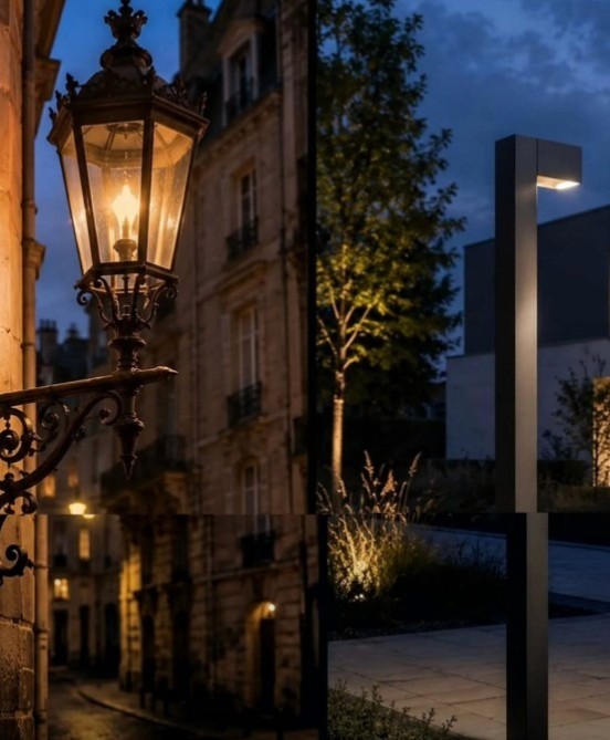
The lamppost with the carved hand was made by someone, for somewhere, for people who would walk past it every day and recognise, in that small excess of effort, something of themselves. The single pole standing in its place is more efficient. It is easier to manufacture, install, and replace. It asks nothing of the street it stands on and offers nothing back.
The question is not whether minimalism is wrong or whether beige is inherently inferior to blue. The question is what we are saying about a place, and the people who live in it, when we choose the palette that asks nothing, remembers nothing, and could have come from anywhere.
The world's cities are slowly becoming the same city. And the cost of that sameness is not just aesthetic. It is the quiet erasure of every particular thing that ever made a place worth belonging to.